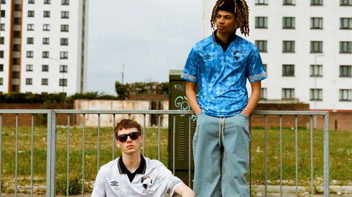
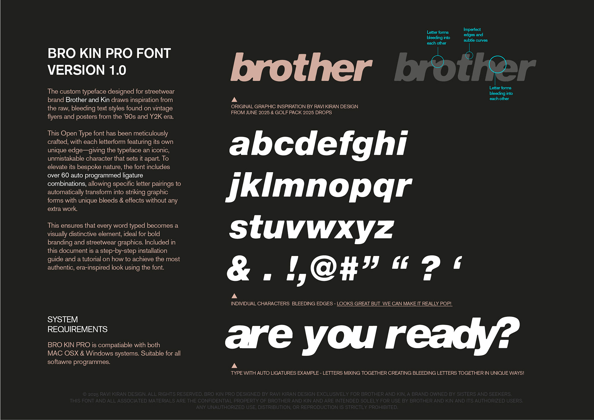
This typeface developed from a single graphic created for Menswear brand Brother & Kin—one that clearly resonated with the brand. Rather than treating it as a one-off, it became the foundation for a custom typographic system.
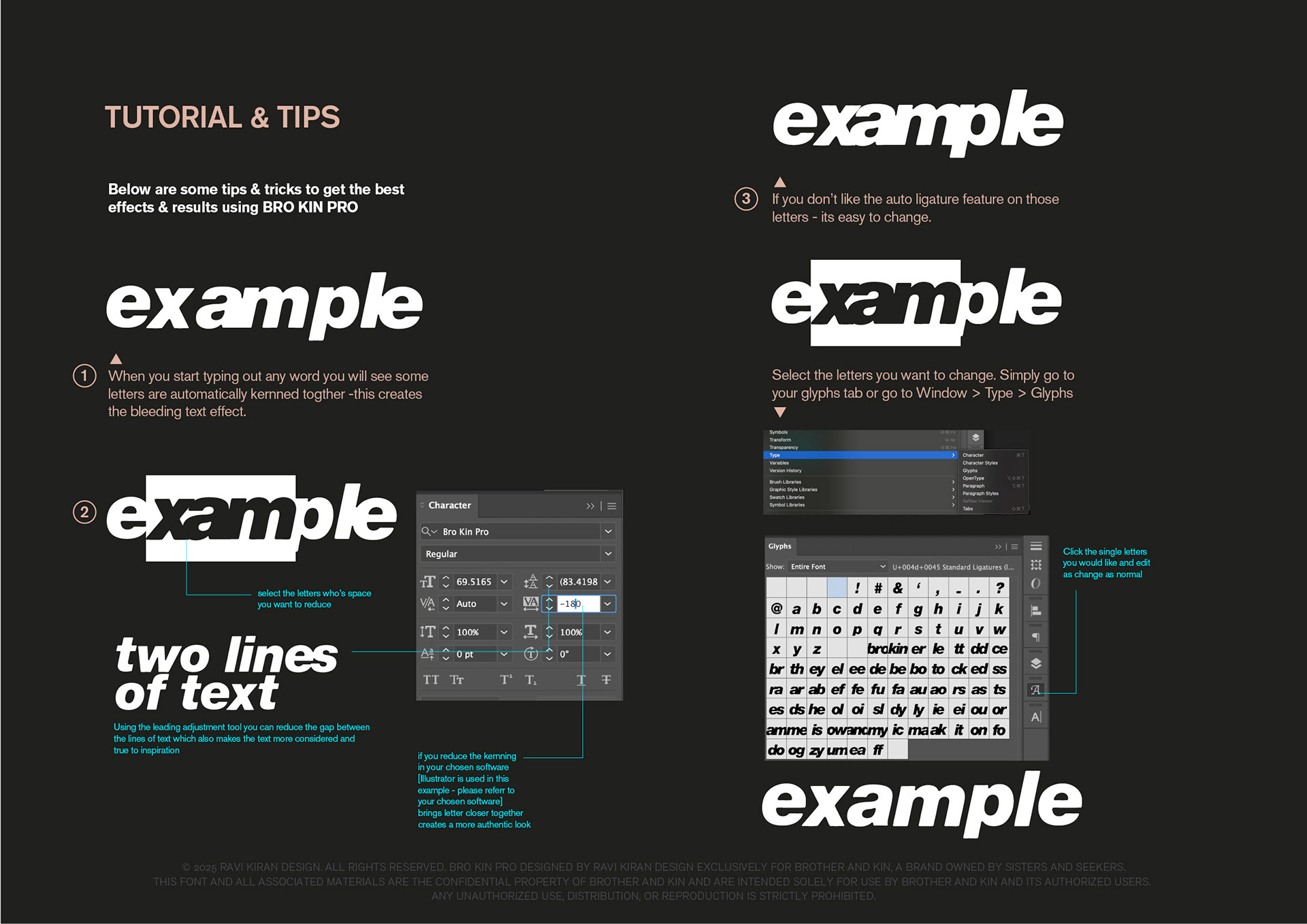
Inspired by the bleed and distortion found in rave flyers and alternative print, the letterforms were built to retain those imperfections in a controlled way. Each character is individually shaped, with a set of programmed ligatures that introduce varying bleed interactions between letters—allowing words to shift subtly depending on their composition.
The result is a fully custom typeface that translates a specific visual idea into a scalable brand asset. It gives the brand a consistent but flexible tool to express its identity across different outputs, while maintaining a strong connection to its original graphic language.

BroKin Pro Font Guide Cover
BroKin Pro Font Guide Breakdown
BroKin Pro Font Guide Installation